
AI Iron Beads Warehouse Redesign
AI Iron Beads Warehouse Redesign
AI Iron Beads Warehouse Redesign
This project focused on improving the usability and information architecture of a pixel-bead pattern and inventory app. The app supports users throughout the making process, from finding patterns to preparing beads and managing materials. Through hands-on use and heuristic evaluation, I found that the original app was organized around system functions rather than users’ making activities. This resulted in unnecessary decisions before users could focus on making. I reorganized the experience around the making process, simplifying pattern discovery and restructuring how patterns, actions, and records are presented.
Type
Personal Project
Duration
4 Weeks
July-Aug 2026
My role
UX Audit
IA Restructuring
UX / UI Redesign
Type
Personal Project
Duration
3 Weeks
July-Aug 2026
My role
UX Audit
IA Restructuring
UX / UI Redesign
Type
Personal Project
Duration
3 Weeks
July-Aug 2026
My role
UX Audit
IA Restructuring
UX / UI Redesign
This project focused on improving the usability and information architecture of a pixel-bead pattern and inventory app. The app supports users throughout the making process, from finding patterns to preparing beads and managing materials. Through hands-on use and heuristic evaluation, I found that the original app was organized around system functions rather than users’ making activities. This resulted in unnecessary decisions before users could focus on making. I reorganized the experience around the making process, simplifying pattern discovery and restructuring how patterns, actions, and records are presented.
This project focused on improving the usability and information architecture of a pixel-bead pattern and inventory app. The app supports users throughout the making process, from finding patterns to preparing beads and managing materials. Through hands-on use and heuristic evaluation, I found that the original app was organized around system functions rather than users’ making activities. This resulted in unnecessary decisions before users could focus on making. I reorganized the experience around the making process, simplifying pattern discovery and restructuring how patterns, actions, and records are presented.

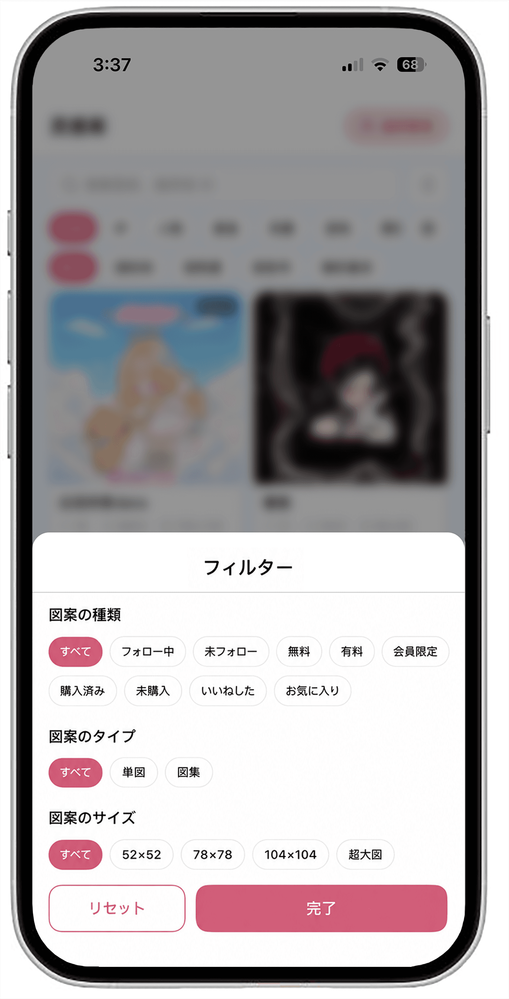
Too many decisions get in the way of making beads!
This app is designed to help users manage their patterns and beads, but the experience often requires users to think about how to use the app before they can focus on making.
Too many options are presented upfront, some decisions appear before they are needed, and important information is not always easy to recognize at a glance.
Instead of reducing the effort of managing a hobby, the interface adds friction to it.


Real-world experience
I used the app with a friend at a local bead shop as part of an actual iron bead making session.
At first, the interface felt more like a database than a making tool. Large amounts of information were presented at once, and we had to figure out where to look and how the system worked before we could start making.
Once understood, however, features such as color highlighting and smart inventory tracking proved useful.
Problem Discovery
As a Perler bead enthusiast, I identified several usability issues through hands-on experience and heuristic evaluation.
Key findings
Too many decisions appear before they are needed.
Important information is difficult to recognize at a glance.
Users need to figure out how to use the app before they can focus on making.
How might we reduce unnecessary decision-making and make essential information easier to understand, so users can focus on making?
Insight
The problem wasn’t a lack of functionality, but the cognitive effort required to use it.
Design Principle
Prioritize essential information
Reduce decision-making
Organize around making workflow
Reveal information when needed
BEFORE
AFTER

BEFORE

AFTER

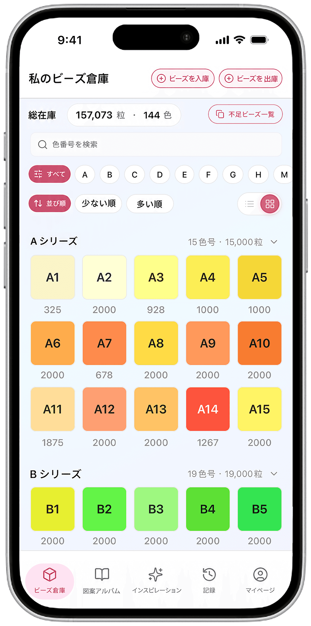

FRICTION POINTS
Weak information hierarchy
Important inventory information was present,
but difficult to recognize at a glance.
Redundant 絞り込み ABC….
Alphabet filters duplicated the existing series structure.
Fragmented 表示形式 selection
List and compact views each solved only part of the problem.


BEFORE
AFTER

BEFORE
AFTER


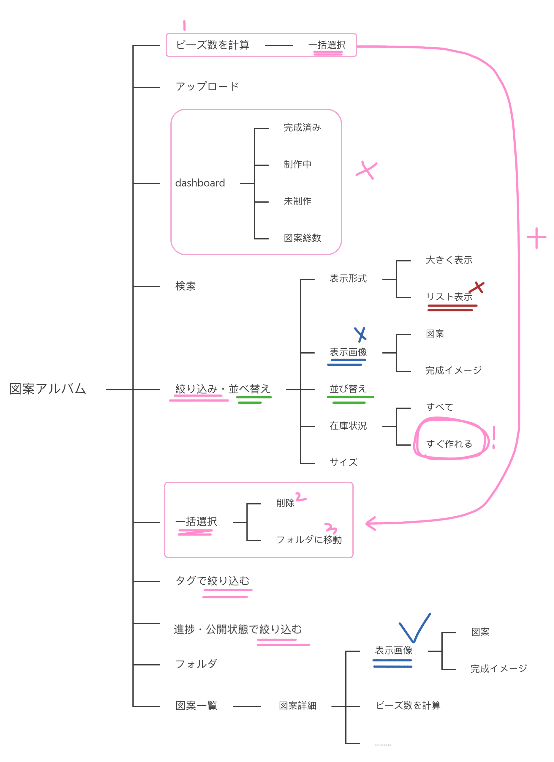
FRICTION POINTS
Statistics distract from discovery (Dashboard)
ビーズ数を計算 appear too early
Too many viewing choices(表示形式)
絞り込み is fragmented
絞り込み and 並べ替え are mixed
表示画像 appear too early
すぐ作れる is buried

BEFORE
AFTER



FRICTION POINTS
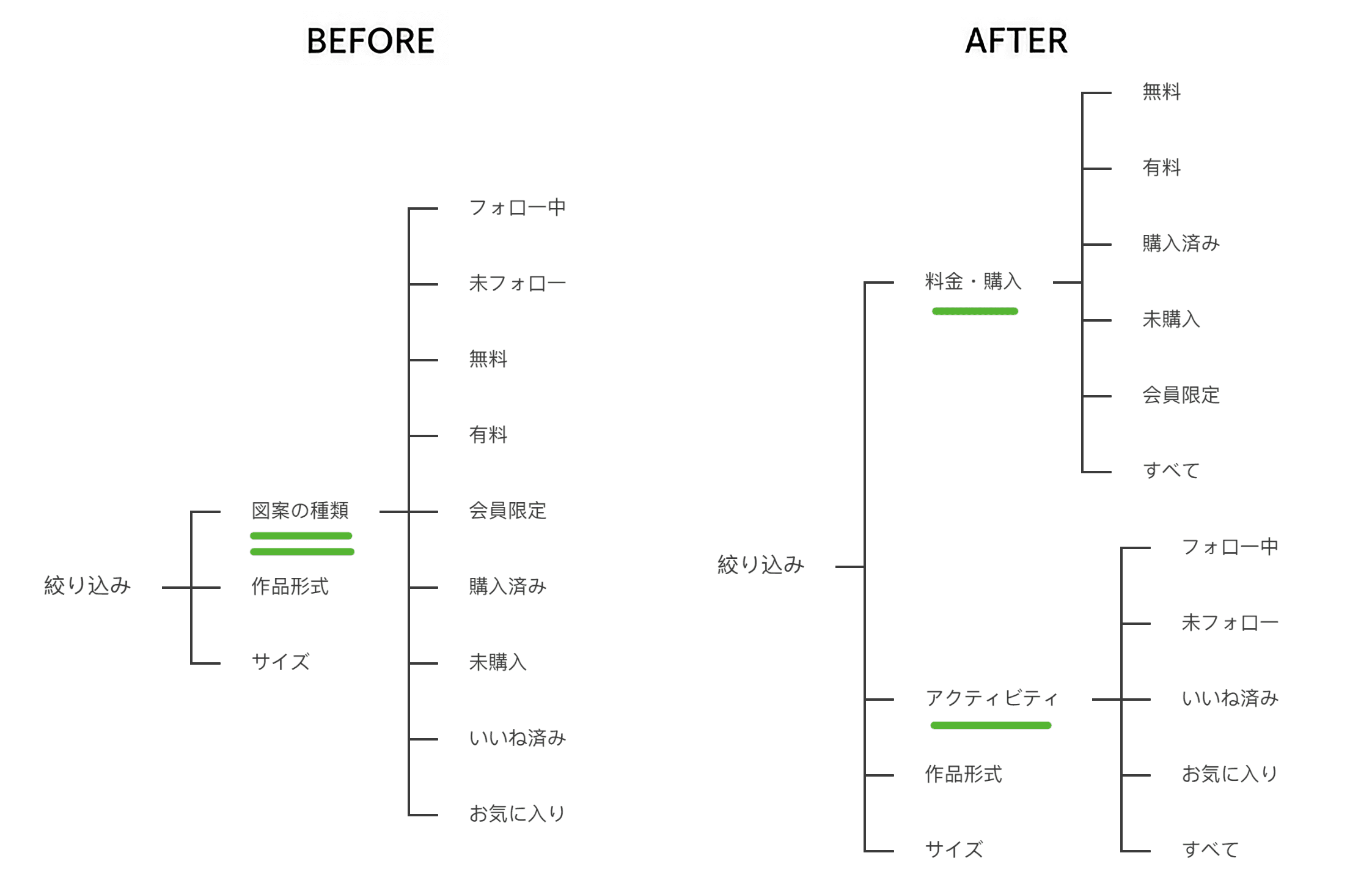
Different filter criteria are presented at the same level.
Group filters by intent: Activity, Purchase & Access, and Pattern Attributes.
The ⚙️ icon does not clearly communicate its purpose.
Replace the generic ⚙️ icon with 「タグを管理」 to clarify its purpose.

BEFORE
AFTER


BEFORE

AFTER

BEFORE
AFTER


FRICTION POINTS
The task was focused on app activity, not making activity
The original records emphasized active days, heatmaps, and usage frequency. I removed these metrics and redefined the task around recording what users actually made.
Cumulative consumption lacked meaningful context
The original statistics showed accumulated bead consumption as a standalone number. I removed cumulative totals and shifted to contextual bead in/out records, so users can understand how their inventory changed through actual making activities.
Too many decisions
get in the way of making beads!
This app is designed to help users manage their patterns and beads, but the experience often requires users to think about how to use the app before they can focus on making.
Too many options are presented upfront, some decisions appear before they are needed, and important information is not always easy to recognize at a glance.
Instead of reducing the effort of managing a hobby, the interface adds friction to it.
Real-world experience
I used the app with a friend at a local bead shop as part of an actual iron bead making session.
At first, the interface felt more like a database than a making tool. Large amounts of information were presented at once, and we had to figure out where to look and how the system worked before we could start making.
Once understood, however, features such as color highlighting and smart inventory tracking proved useful.
Problem Discovery
As a Perler bead enthusiast, I identified several usability issues through hands-on experience and heuristic evaluation.
Key findings
Important information is difficult to recognize at a glance.
Too many decisions appear before they are needed.
Users need to figure out how to use the app before they can focus on making.
Insight
The problem wasn’t a lack of functionality, but the cognitive effort required to use it.
How might we reduce unnecessary decision-making and make essential information easier to understand, so users can focus on making?
Design Principle
Prioritize essential information
Reduce decision-making
Organize around making workflow
Reveal information when needed
BEFORE
AFTER
BEFORE
AFTER
FRICTION POINTS
Weak information hierarchy
Important inventory information was present,
but difficult to recognize at a glance.
Redundant 絞り込み ABC….
Alphabet filters duplicated the existing series structure.
Fragmented 表示形式 selection
List and compact views each solved only part of the problem.


BEFORE
AFTER
FRICTION POINTS
Statistics distract from discovery (Dashboard)
ビーズ数を計算 appear too early
Too many viewing choices(表示形式)
絞り込み is fragmented
絞り込み and 並べ替え are mixed
表示画像 appear too early
すぐ作れる is buried
BEFORE
AFTER
Too many decisions get in the way of making beads!
This app is designed to help users manage their patterns and beads, but the experience often requires users to think about how to use the app before they can focus on making.
Too many options are presented upfront, some decisions appear before they are needed, and important information is not always easy to recognize at a glance.
Instead of reducing the effort of managing a hobby, the interface adds friction to it.
Real-world experience
I used the app with a friend at a local bead shop as part of an actual iron bead making session.
At first, the interface felt more like a database than a making tool. Large amounts of information were presented at once, and we had to figure out where to look and how the system worked before we could start making.
Once understood, however, features such as color highlighting and smart inventory tracking proved useful.
Insight
The problem wasn’t a lack of functionality, but the cognitive effort required to use it.
Problem Discovery
As a Perler bead enthusiast, I identified several usability issues through hands-on experience and heuristic evaluation.
Key findings
Too many decisions appear before they are needed.
Important information is difficult to recognize at a glance.
Users need to figure out how to use the app before they can focus on making.
How might we reduce unnecessary decision-making and make essential information easier to understand, so users can focus on making?
Design Principle
Prioritize essential information
Reduce decision-making
Organize around making workflow
Reveal information when needed
BEFORE
AFTER
BEFORE
AFTER
FRICTION POINTS
Weak information hierarchy
Important inventory information was present,
but difficult to recognize at a glance.
Redundant 絞り込み ABC….
Alphabet filters duplicated the existing series structure.
Fragmented 表示形式 selection
List and compact views each solved only part of the problem.

BEFORE
AFTER
BEFORE
AFTER
FRICTION POINTS
Statistics distract from discovery (Dashboard)
ビーズ数を計算 appear too early
Too many viewing choices(表示形式)
絞り込み is fragmented
絞り込み and 並べ替え are mixed
表示画像 appear too early
すぐ作れる is buried
BEFORE
AFTER
FRICTION POINTS
Different filter criteria are presented at the same level.
Group filters by intent: Activity, Purchase & Access, and Pattern Attributes.
The ⚙️ icon does not clearly communicate its purpose.
Replace the generic ⚙️ icon with 「タグを管理」 to clarify its purpose.
BEFORE

AFTER
BEFORE
AFTER
BEFORE
AFTER
FRICTION POINTS
The task was focused on app activity, not making activity
The original records emphasized active days, heatmaps, and usage frequency. I removed these metrics and redefined the task around recording what users actually made.
Cumulative consumption lacked meaningful context
The original statistics showed accumulated bead consumption as a standalone number. I removed cumulative totals and shifted to contextual bead in/out records, so users can understand how their inventory changed through actual making activities.

BEFORE
AFTER
FRICTION POINTS
Different filter criteria are presented at the same level.
Group filters by intent: Activity, Purchase & Access, and Pattern Attributes.
The ⚙️ icon does not clearly communicate its purpose.
Replace the generic ⚙️ icon with 「タグを管理」 to clarify its purpose.
BEFORE
AFTER
BEFORE
AFTER
FRICTION POINTS
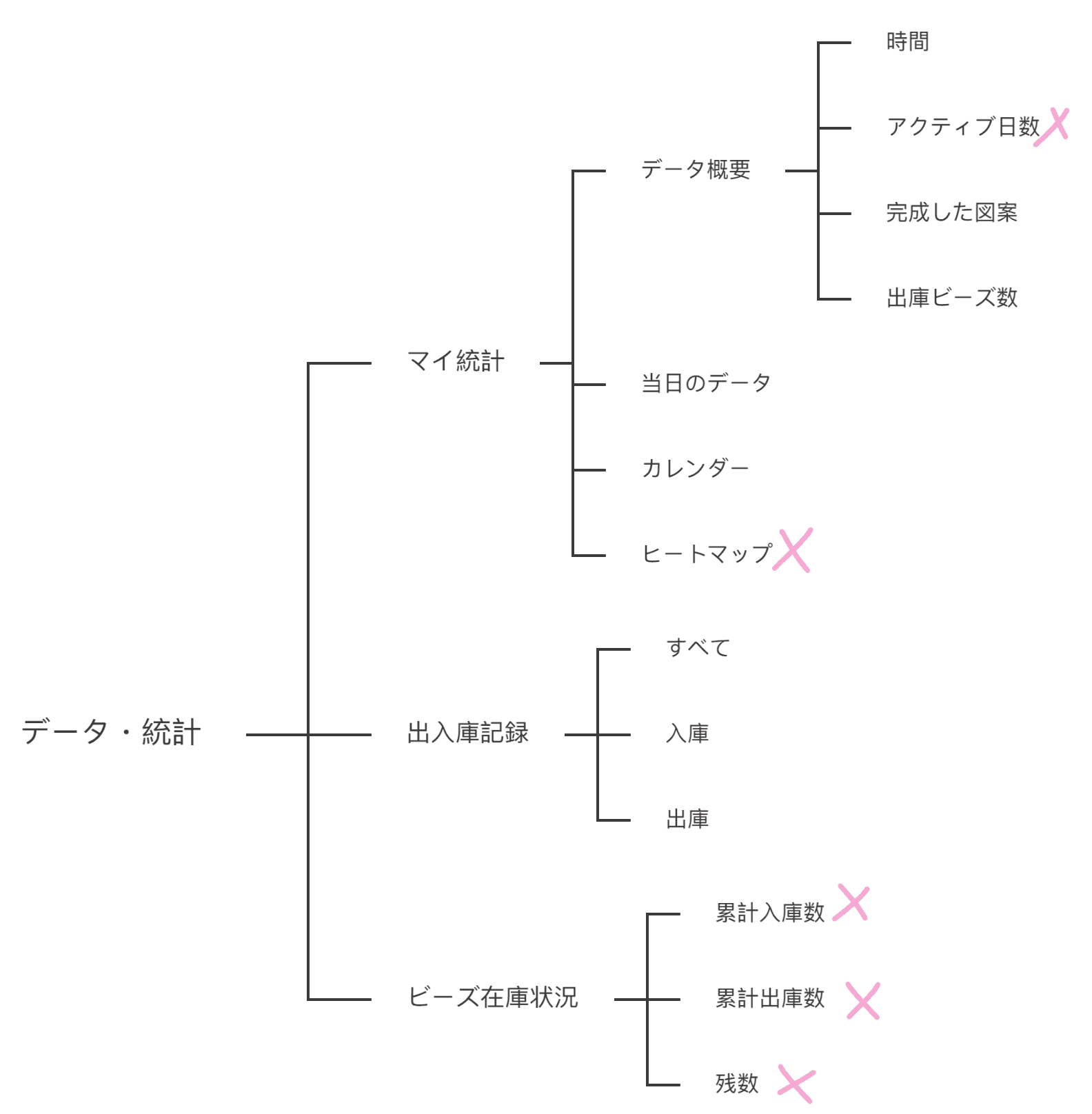
The task was focused on app activity, not making activity.
The original records emphasized active days, heatmaps, and usage frequency. I removed these metrics and redefined the task around recording what users actually made.
Cumulative consumption lacked meaningful context.
The original statistics showed accumulated bead consumption as a standalone number. I removed cumulative totals and shifted to contextual bead in/out records, so users can understand how their inventory changed through actual making activities.
BEFORE
AFTER